Talk: OUT OF DATE with Zoe Brand
I started my professional career at the age of 15 selling rather expensive pens and writing paper in my hometown of Brisbane, wasn’t awe inspiring stuff, so in my early 20’s I moved to Sydney, partly to escape the heat and partly for a new adventure to find myself. What I found (after a few years of hanging about) was a flyer in my letterbox advertising short courses in jewellery making at COFA. This sounded excellent and it was. It led onto Advanced Diploma in Jewellery and Object Design, from the Design Centre, Enmore and jobs working and volunteering in galleries, making lots of jewellery, curated shows, writing catalogue essays and drinking plenty of beer. By my late 20’s I was thinking I better get more serious about my practice, so I packed up and moved again, this time to Canberra to do Bachelor of Visual Arts majoring in Gold and Silversmithing at the Australian National University, where I graduated with First class honors in 2015.
I now live in a small country town called Majors Creek on Yuin Country with my partner Keith and our two small children Mae 5 and Kit 3. Humorously, slightly embarrassingly and entirely unintentionally if you run their two names together you get MAEKIT, and that’s pretty much what I do.
I make jewellery that uses jewellery archetypes, ready mades and text to explore the performative nature of jewellery as a device for communication. Contextually I place my practice within the field of contemporary jewellery but also within a historical and conceptual art practice and theory.
Words and language haven’t always been my strong suit, in fact I pretty much failed English as a subject in high school. Zoe is a cheerful and enthusiastic student, but only grasps a sound appreciation of the basic principles. Spelling was a big problem, and I would often workaround this by finding a similar meaning word that I could spell, rather than using the basic word that I couldn’t.
So becoming an artist who mainly uses text as a material certainly has a delightful irony about it.
I habitually gather texts from anywhere and everywhere for my work. Often from books and catalogues about art and conceptual artists. As well as show card and sign writing books from the early 1900’. From general advertising ephemera and signs in shop windows to online media. I also do a lot of driving listening to the radio, podcasts and my vintage CD collection, occasionally pulling over to take note of a good sentence or phrase that has stuck a cord.
A few years ago I was gifted a book called Fifteen thousand useful phrases: a practical handbook of pertinent expressions, striking similes, literary, commercial, conversational, and oratorical terms, for the embellishment of speech and literature, and the improvement of the vocabulary of those persons who read, write and speak English by Greville Kleiser, published in 1917. For this I am eternally thankful, surely I’m set for the rest of my career?!
You won’t be surprised to know that I have numerous lists of phrases, questions, remarks and statements. I’m always editing these lists, sorting and questioning the words, and occasionally wondering what the hell does that mean, on some phrase that at one time made sense, but once its origin was forgotten the text no longer held up on its own.
I’ve always been attracted to the language of advertising. When buying a used car, another unnecessary kitchen appliance or a fancy diamond ring the sell is often the same, generic and universal. I love to trawl secondhand online marketplaces not only for the things that are sold, but also the language used to describe it, “not the best quality, but still good”.
Lifting words and phrases that, once removed from their original context, engraved, pressed, cut or gilded into a new surface, then placed on the wall or on a body, allows the texts to open up to any number of possible meanings. A question that I’m always asking myself is how language can be understood as both personal and universal.
I’m really interested in phrases that have distinct multiple or ambiguous readings when taken out of their original context. I’m concerned with finding language that describes both the object or the idea of the object, as well as well the person who might wear the piece. I often use the pronoun ‘this’ in my work as a word that is used to identify a specific thing or person.
The power that language has, is for its meaning to change depending on context. The texts I choose to use are purposely slippery, they can mean different things from one day to the next. This is an exciting and occasionally daunting prospect.
For example, when I was making this particular work “Brutal recognition of failure”, its meaning for me was supercharged almost overnight, made one day before the world’s media blew up with the black lives matter protests, and again since with the voice referendum.
FOUND OBJECTS AND RECLAIMED MATERIALS:
Sometimes a found object or readymade is perfect as it is, it encapsulates the essence of something and it doesn’t require anything more. Other times a few tweaks and a title and the work becomes something else altogether. I use a lot of found and reclaimed objects and materials in my work, some I leave with minimal intervention, others I stitch together into new wearable pieces. I like using reclaimed objects or material because they already have a history, that it’s not fresh and new, but a bit messy, dirty or complicated.
Works such as “WILL YOU”, which consists of a commercial SOLD place holder ring and red velvet heart shaped box.
You might not have come across these before, but these SOLD rings are used in jewellery shop windows to replace a ring once it has sold. They are often plastic or base metal sometimes with a fake gem. The intention is that the window does not look bare or out of stock, but also to visually hint at the retail marketing ploy ‘selling fast, get in quick before you miss out’. Like Künzli’s The Red Dot, when placed in a gallery setting this work is removed from its original context which espouses the object to new possible meanings. I’m playing with notion that a diamond ring acts as a conduit for the promises and values associated with marriage, and question ideas of value, of commerce, of transactions and relationships in a far more cynical way.
Another work Sometimes there really is nothing to 'get' and the King is simply naked. Which is made up of Fancy ring boxes and plastic price tags (actual)
18k gold, Diamonds, Sterling Silver, Emerald and 9k Rose gold (imagined) with a price tag of $7350.00 (total),
Riffing on the cautionary tale of the Emperors New Clothes, of believing something is true or praiseworthy due to an unwellness to upset the status quo or the powers that be. It’s a humours work, playing to the notion of value, status, fakery and truth. It illustrates perfectly how taking in the title and materials of a piece can smash open a viewers understanding of a work.
“SHE WAS THE PROMISE OF HER GENERATION” made from White cotton gloves that were inadvertently stolen from gallery install jobs between 2014 - 2017, siliconized polyester stuffing, and white cotton thread.
This work made in the vein of a Jacobean ruff, was inspired by a comment made to me by an art collector, who told me to call myself an ‘Artist” rather than a “Jeweller”, implying that by doing so I would be taken way more seriously and perhaps given more status. It’s made from the ubiquitous white cotton gloves used in art handling; I was an art installer for 15 years, and when not in use I would stick them in my back pocket thus inadvertently ending up taking them home with me. If you dig around some more, you’ll find a small poke at the often miss-used quote “those who can’t do, teach” here as well.
These works are called “A piece of someone else’s success” and are made from past exhibition advertising banners acquired from the Drill Hall Gallery and cord. Every exhibition the gallery would hang a huge banner outside the building, it would have an image of the artist’s work and below the exhibition title, artist name, dates etc. I was interested in cutting out the text in abstracted shapes and colours, but also utilising the eyelets around the edge of the banner to become the method of wearing. By using the banner material as the very symbol of success, a virtual “name up in lights” situation, and creating them into wearable talismanic jewellery objects, you too could have a piece of someone else’s success, perhaps foretelling some of your own.
While we are here, I might make mention of another little project that is called Gallery Install/de Install brooch. Which came about after spending many hours up a ladder scraping meters of wall text off the gallery wall during an deinstallation. The sticky residue of the vinyl lettering became a perfect little (and sometimes not so little) brooch. The wall text, or artists name, or exhibition title now as an unidentifiable messy blob stuck an art installers chest or shoulder. But still holding all the history of what it once was.
PERFORMANCE:
Another aspect of my practice is directly engaging with an audience to explore the performative nature of jewellery as a device for communication. I find archetypes of jewellery and personal identification such as badges and name tags to be perfect source to exploit as most people have an inherent understanding of their purpose to identify something about the person wearing the piece, their name, their political persuasion, or something they proudly support or want to advertise.
One of my first performances was called “YES NO MAYBE”, which consisted of me, a stool, a clipboard and a table with three bowls, one with 100 YES Badges, one 100 NO Badges, and with 100 MAYBE badges. I was positioned on a busy city street corner which was also a main train station throughfare. I offered anyone who stopped a choice of badge, YES, NO, MAYBE. I marked off each once as they were taken. I have no idea what happened to that documentation, so unfortunately I can’t tell you exactly the stats, but anecdotally I was left with a lot more YES’s than I thought I would, it was a glum day so perhaps that affected the mood of the audience. The point of this work was very simply a small act, a small intervention that when that person took a badge, put it on and wore it about for the rest of the day, that it might act to spark a conversation, “YES”, or a word of warning, “NO”, or a quizzical/ok knowing look “MAYBE”.
The Blank Badge Project asked: how do people react when you wear a blank badge pinned to your chest? Do people expect a badge to carry a symbol, message or slogan? Why is it blank?. And it investigated how a blank badge might motivate people to interact with one another. One of my favourite interactions and prime example proof of concept, was on an occasion to a visit Parliament house in Canberra, as the guard went to wave me though security, he looked and pointed at my Blank Badge and asked “are you waiting for a cause?”. I packaged up 100 or so blank badges and gave them away, I asked for people to send me back their responses and reactions to wearing them, and the comments that were made. It was all documented on an unfortunately now defunct website TheBlankBadgeProject.
While on the topic, I’ll make mention of one last badge intervention, called OBJECT TEMPORARILY REMOVED. Which occurred when I attended the annual MUNICH jewellery week, with a 100 badges and proceeded to ask people to remove the piece of jewellery they were wearing and replace it with one of my badges. Using museum and gallery language and re contextualising it made for a delightfully cheeky and humorous way to getting my work seen and starting lots of great conversations.
A fellow member plays on the colloquial and mostly innocuous but often loaded phrase ‘mate’. This work invites anyone to take a tag if unattended, or be given one by the attendant if approached. It consists of dispenser that dispensers handwritten sticky tags all with the word “mate” on them.I have performed the ‘mate dispenser’ on a few occasions, mostly at openings, where a whole crowd of people become labelled/ named MATE. By giving action to the word though the use of sticky nametags, participation and performance, this work aims to create an interesting conversation around who we are, where we belonging and how we ‘fit in’. Which may or may not end up in a very different place to where it started.
SIGNS
I’ve have always been fascinated by signs. As a family when we went on driving holidays, for some reason we always shouted out names of shops or read aloud directional signs. And I often find myself taking photos of signs wherever I go. It turns out that I have quite a collection of ‘CASH FOR GOLD’ or ‘WE BUY GOLD’ photographs. I’m not sure what draws me to them; perhaps it is that they look the same wherever you go claiming: CASH FOR GOLD. They almost always have the same font, bold black text in spelt out in capitals, on a yellow background. I made this work at Uni, and it probably the most technically difficult work I’ve ever made, but also just a great funny piece.
As mentioned I’m drawn to use readymade forms, and in these next works more specifically from the plethora of signs and ephemera that are associated with commercial or retail environments. Such as advertising sandwich boards, open/closed indicator signs, directional signs, posters and souvenirs. It’s important that these works are seen as an artwork (a sign) and a wearable (a neckpiece). However the installation of the work is very specifically chosen to only show the aspect of the artwork – the signs hung or placed against the wall or in a freestanding display.
THIS IS ALL I HAVE EVER WANTED which is made up of a commercial display stand populated with pressed aluminium signs in 8 different texts, these texts are: THIS THEN WHAT, THIS IS IT, IS THIS IT, WHY IS THIS IT, WHAT ABOUT THIS, HOW IS THIS RELEVANT, THIS CHANGES EVERYTHING, IS THIS ENOUGH.
This was a piece that signalled a very distinct turning point in my approach to making and it came from a desire to move away from direct jewellery forms and look towards readymade canvases that have an association to the body without being directly jewellery. I was inspired by Jenny Holtzer who writes in her catalogue Jenny Holtzer: Signs “a good Cliché can go anywhere…” In doing this I could incorporate more text but also to expand my definition of jewellery, how it act as a communication device.
Over the years I have expanded on these texts and added more such as, PAY ATTENTION TO THIS, IS THIS BORING, COULD THIS BE SOMETHING and as well as using the pressing process to create other works with texts that reference commercial signs, such as SOLD SOLD SOLD, LAST CHANCE, ONLY ONE LEFT. I love how these signs are read when they are on the body! The material is very thin aluminium that is used in the roofing industry, and easily available from hardware stores. It does not have a perfect finish and is scratch and marked. I like this about it, it’s not precious, it fits with the production multiple, its cheap and it allows me to make the works cheap and accessible as well. In 2019 a month or so before I was due with my first child, I received an email from a gallery in New Zealand to see if I had anything that might be suitable to show with them. ‘Sure’ and delved into the archive. Opportunities like this give you an excellent chance to look at your work in a different way, so I sent them a box of 35 pressed pieces, including originals, seconds and prototypes. I left it up to them to display and make connections with the texts. To say I was thrilled how it turned out would be an understatement, this arrangement has become a whole work, called NO REASIONABLE OFFER REFUSED, and you can see it hanging here in your gallery in the current exhibition WORD-UP.
This next work consists of three hanging signs in the shape of arrows. The arrows are white acrylic with text on each side that has been pantograph engraved and back filled with black crayon. Each of the three signs has a different text on it: “I WANT THIS”, “I WANT THIS MORE” and “I WANT MORE THAN THIS”. They all hang in a row and are situated on the wall just above head height. Each arrow points out from the wall from and hangs down from square extruded brackets that are mounted to the wall. The signs attached to the brackets via chrome plated industrial chain and can be removed and worn as a necklace.
The language of both jewellery and art can speak of desire, longing and want. The intention of these pieces is to go further and question the virtue of these notions. Depending on which direction the viewer approaches the work will depend on how they encounter the text. From one direction the works read in I WANT THIS, I WANT THIS MORE, I WANT MORE THAN THIS, if approaching from the other side they would read it in reverse. Further to this the form of the work also alludes to the pop culture icon of the ‘I’m with stupid’ t-shirt, when worn on the body.
This piece consists of two large boards that are connected with two black straps to create a wearable sandwich board. The two boards are painted white with the text “THIS IS BIGGER THAT YOU” hand sign painted in black on the front and the back of the piece. The installation of this work in the gallery is leaning against a wall while propped atop a black plastic milk create, as if the person who was wearing the piece just stepped out for a coffee and will be back at any moment.
The sign painting of this work has been very purposely outsourced to a professional sign painter, Marshall Dunn. For this work I am referencing the outsourcing of ‘craft’ or ‘skilled’ work that has become a commonplace debate in the field of contemporary art and craft. American artist John Baldisseri subverts this question a different way with the view that ‘another way to curtail and lampoon the agency of the artist is having others do the works in his stead’
This work is a satirical appropriation of a large warning sign that is ubiquitous on Australian roads and highways. ‘WRONG WAY, GO BACK’ leaves no doubt as to its meaning and indeed cautions the misguided of potential dangers ahead. This work alludes to uneasiness with our current political and cultural climate, one that is full of ignorance from all sides. How far until there is no going back?
NOTHING BUT TEXT
It was probably in my second year at ANU that I started to use text in a very specific way. I was using aluminium sheet, and for the first time the history of material I was using wasn’t so important but the fact it was light and easy to work with. These pieces were 14cm in diameter bit larger than the size of a CD. I used a small jewellers saw and pierced the text out of them, then they were powder coated white. I was really trying to purge everything from the piece except the text (in a very Baldisseri way). Now on first glance these works look pretty good, infact most people thought I had them laser cut, but actually, I enjoyed every moment of hand cutting the text out, meditating on the curve of an S or cursing over the point of an M. I liked how the closer you got to the works, you could see something not quite right about them. I feel like it gave the works a thickness even though they weren’t even a mm thick. This series was call “A Failure to Communicate, More or Less” an ongoing series of signs. I’ve continued to make these works over the years, sometimes adding colour or texture to them.
I made a little side series called A BODY OF WORK, it consisted of phrases that are used when looking at, describing or critiquing art, A STRAIGHT LINE, A FOCAL POINT, A GOOD PROPORTION, A COMPLEX NARRATIVE, A BAD EXECUTION. But also phrases that could be used to describe a body or person. I used fake marble that comes in spray can form to paint the surface of the works. I wanted to give them an old European art museum quality to them. It’s a funny work, but when it made its debut in an exhibition in Germany it fell very flat. It seems and this is not the first time this has happened to me, that not everything translates as it should.
Perhaps what I’m most know for are my series of HARD TEXTS, or my pantograph engraved acrylic works. For the last few years, this has been my bread and butter. These works are at once both exhibition and production works, often only using a text once, or in a small series. Like the disc pendants these works are very much about the text, but I am much more playful in the canvas I choose for each one. Because acrylic comes in many fun colours and patterns, and I love to pair texts and colours very specifically together. In the middle of lock down I made a series that that was bright and colourful, but the text just said “sad” all in lower case.
These pendants act as signs but are also fragments of conversations and thoughts that loosely tell the story of my comic/tragic relationship with routine consumption and everyday consumerism and well pretty much just existing in this world that we live in.
These works are often made on the fly too, I like to walk into the studio and make something straight away, just picking a text from the list that feels very of that moment, choose some acrylic and then just get cracking. I made one the other day that read “EVERYTHING HURTS”, And I meant that in both the bodily sense, I’m now on the other side of 40, but also the world.
In this sense my works are extremely personal however they aren't about "these times” as such, but rather they have come about because of them. Of course they reflect them and fit into the discourse around them, but are not stuck in them. Everyone will experience my works differently and bring their own histories and understanding to them, that really is one of the things I love about making text based works.
GLASS AND SILENCE
Last year I was given the opportunity to exhibit at the Canberra Glassworks. I asked if the work had to be glass, yes, did I know anything about using glass, no. But the director Amiee Fordshom invited me because she could see connections in my works and practice that could be explored through glass. I was excited, then I realised I had to think in a whole new material and get on board with Glass being a team sport, as jewellery is generally a solo practice this was hard to get my head around. For me there had to be a reason for me to make my work in glass and not just for the sake of it, so I struggled with that for a while. I was lucky to attend a masterclass with Will Lynn a giant in the signwriting and gilding world, and As someone who is always looking for new ways to put text on things, this was an absolute revelation. The allure and magic of using of gold, ironically a material I hardly ever use in my practice, and gilding it onto found glass objects was perfect and natural next step.
I worked with the glassworks team to create TRY AGAIN an amusing installation featuring 350 gilded, hand-cast glass tokens that delve into the themes of manufacturing and multiples. These tokens pay tribute to our collective failures and serve as a reminder that the process is just as important as the destination. Each TRY AGAIN is cast with raw glass material with problematic qualities, what we call the ‘bad batch’ at Canberra Glassworks, a regular by product of a glass hot shop. Used to make TRY AGAIN these waste materials are reclaimed so not become landfill. When piled together the mass of TRY AGAIN golden tokens glow in mocking brilliance, as if gloating that trash has become treasure.
I wanted to get back to my roots of using found objects, mostly because “new” glass didn’t do anything for me, and I liked the idea of using glass that I found gross or questionable and applying layers and layers of gold to it. Not only that but the textured glass gave me somewhere to hid with limited skill. Glass chopping boards have become my favourite thing to look out for in opshops, they are so abject, they don’t feel nice to use, they soak up liquids, but they are the perfect size for my works. Because I was stepping away from making jewellery for this show, I wanted to make sure the works still had a relationship to the body. Chopping boards, coffee tables, lazy Susan’s, computer desks, these all fit that requirement, but also becoming their own objects in themselves.
LINGER FOR A FEW LEISURELY SECONDS, you might not quite recognise that glass pattern, but this is smaller side table version of one of those ubiquitous glass outdoor tables that no doubt all of you have spent at least one a late night around, shared a meal with family or friends, or smashed while throwing a ball around the yard. I so badly wanted to make a work out of one of these larger tables, its perfect with its umbrella hole, primed for a bit of rope to turn it into some serious building bling but I’m yet to find a benefactor to fund my gold habit.
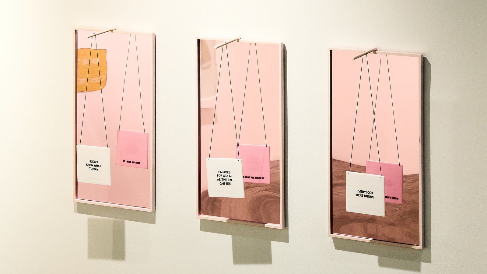
Right now I am working on some new pieces, these are work in progress photos, This time using glass cheeseboards and candle holders bought from my local opshop. These objects are about to live an alternative life as jewellery. What can I say they are the perfect found object with a built-in handle that will become the mechanism for which to hang a cord. The other thing with these works is they are silent. There will be no text on them. It’s not that I’m lost for words, although perhaps I am, but the world just seems to be on fire. It’s hard to know what to say, but also it’s no good being quiet either.
THE END
John Baldessari, he once described his practice as ‘the quest for the paradox of simplicity and complexity” and that certainly resonates with me, as my works on the surface may seem purely graphic, flippant and perhaps a bit glib, they are constructed with care, ideas, thoughts, consideration, cynicism and of course a good dash of humour.
Thank you